

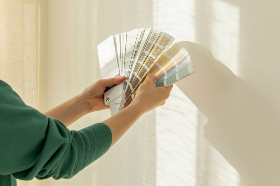
Choosing paint sounds simple until a tiny swatch turns into four walls of color. A shade that looked perfect online can suddenly feel too cool, too dark, or completely different once it’s in your home. The safest choices aren’t always the most neutral, either. Lasting color usually comes from understanding light, undertones, proportion, and how a room is actually used before committing to the first shade that catches your eye.
Start With the Mood You Want
Before looking at paint chips, decide how you want the room to feel. A bedroom may call for something soft and restful, while a dining room can handle more drama. Kitchens often benefit from colors that feel fresh and energetic, while living rooms usually need to work across several activities and times of day.
Thinking about mood helps narrow the field before hundreds of nearly identical shades become overwhelming. Warm colors tend to feel more intimate, while cooler tones can feel calmer or crisper. The goal isn’t to follow a rigid rule, but to choose a direction that suits the room’s purpose. When the color supports how you want to feel in the space, you’re less likely to tire of it quickly.
Pay Attention to Undertones
Two colors can look almost identical on a paint card and still behave very differently on the wall. Undertones are the subtle hints of red, yellow, blue, green, or gray that influence how a shade reads once it’s surrounded by flooring, furniture, countertops, and natural light.
Compare potential colors against the fixed elements in the room rather than judging them alone. A beige with a pink undertone may clash with yellow-toned wood, while a cool gray can make warm stone look dull. Whites are especially tricky because some lean creamy while others feel blue or stark. Looking at several options side by side usually makes the undertones easier to spot.
Test the Color in Different Light
Never rely on a paint chip alone. Light can completely change how a color appears, and the same wall may look different in the morning, afternoon, and evening. Natural light from a north-facing window can make colors feel cooler, while strong afternoon sun may pull out warmer tones you didn’t notice at first.
Paint a generous sample directly on the wall or use a large movable sample board. Check it throughout the day, then look again after dark with your usual lamps and overhead lighting turned on. Artificial light can shift color just as dramatically as sunlight. A shade you love at noon may feel muddy or harsh at night, so living with the sample for a few days is worth the extra time.
Use the Room’s Existing Finishes as a Guide
Paint rarely exists in isolation. Flooring, tile, countertops, upholstery, wood tones, and large furniture pieces all influence how a wall color feels. Choosing paint without considering those elements can leave the room looking disconnected, even if the shade itself is beautiful.
Start with the finishes that are hardest or most expensive to change. Pull subtle colors from stone, fabric, artwork, or wood grain to create a more cohesive palette. You don’t need an exact match. In fact, a slight contrast often looks better. The goal is to find a color that relates to the room rather than competing with it. When the major elements already work together, paint has a much easier job.
Think About How Rooms Connect
A paint color may look great in one room but feel awkward when viewed from the hallway or adjoining space. Open doorways, sightlines, and open-plan layouts mean several colors are often visible at once, so the overall flow matters just as much as the individual choice.
You don’t need to paint the whole house one shade. Instead, choose colors that share a similar undertone, intensity, or temperature so transitions feel intentional. A soft green might work beautifully beside a warm cream, while a deep blue could connect through repeated accents elsewhere. Thinking beyond one room helps create a home that feels layered rather than pieced together.
Don’t Let Trends Make the Decision for You
Trending paint colors can be a great source of inspiration, but they shouldn’t automatically become the default choice. A shade that dominates social media may look completely different in your home, and popularity doesn’t guarantee that you’ll enjoy living with it for years.
Ask yourself whether you genuinely like the color or simply like seeing it in styled photographs. If you’re drawn to something bold, consider using it in a smaller room, on cabinetry, or as an accent before covering several large spaces. Personal preference tends to age better than trend chasing. The best paint color is one that still feels right after the novelty wears off.
Choose a Color You’ll Want to Live With
Paint is one of the easiest ways to change a room, but that doesn’t mean choosing it should be rushed. A little patience before committing can save you from repainting a space six months later because the shade behaves differently than expected.
Let the room guide the decision. Consider the light, permanent finishes, neighboring spaces, and the mood you want to create, then test your favorite options under real conditions. A color that feels good in your home at different times of day is far more likely to stay appealing long after the paint has dried.